How might we translate our AI-powered trademarking tool to a high volume search tool for law firms, naming agencies, and large enterprise?
Haloo’s initial focus on serving small business owners, recognized an untapped market opportunity to extend the reach of its innovative AI-powered trademarking search and filing tool to large enterprises. The decision to broaden our user base stemmed from the ambition to cater to the diverse needs of businesses operating on a larger scale.
Our overarching goal was to introduce a cutting-edge Software as a Service (SaaS) application designed specifically for enterprises. This new offering would empower users to conduct trademark searches at scale, catering to the elevated demands of law firms, naming agencies, and large enterprises. Beyond the core functionality, we aspired to enhance the user experience by incorporating additional tools that would enable efficient team management and seamless communication within the platform.
Users faced a significant constraint as the platform lacked the capability to perform trademark searches in bulk. This limitation hindered users managing extensive portfolios or conducting large-scale market analyses, impeding efficiency and the swift attainment of comprehensive results.
The absence of a dedicated system for managing past trademark searches hindered users in tracking and referencing historical data, leading to inefficiencies in monitoring trends and maintaining a cohesive record of the company's trademark exploration activities.
Another notable drawback was the restriction of utilizing a single account for an entire company. This not only compromised security and access control but also created logistical challenges in terms of user management
The traditional, one-by-one search process proved to be a bottleneck for users seeking expediency. The slow and manual nature of this approach not only consumed valuable time but also introduced the risk of oversight or errors.
No formal user research was conducted due to the urgent demand for the product. Instead, we leveraged the expertise of our in-house lawyers, who are also our target users, collaborated with AI technologists, and conducted limited user test sessions with select large enterprise companies using prototypes.
Users want robust functions to manage multiple aspects on the platform.
Conveniently and quickly conduct bulk trademark searches, streamlining the process for those dealing with high-volume trademark-related needs.
Give admin users the capability to assign specific permissions within the application, ensuring a tailored and controlled access experience for authorized individuals.
Enhance collaboration and streamline workflows, our platform incorporates a team hierarchy feature, providing users with a structured and efficient way to manage their teams.
Allow admin users to thoroughly examine and approve reports, ensuring a robust and controlled system for document validation.
What are the pain points of the app?
- Create a hierarchy system Teams -> projects -> trademark searches
- Include an in-depth user management system
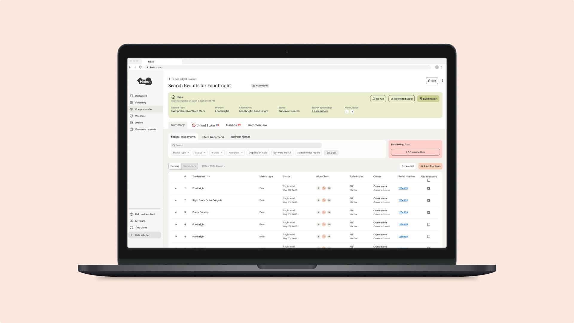
- Create a risk report system that is clear and easy to understand (pass, pause, fail)
- Create a way to manage comments and notifications
As it was my first time designing a enterprise platform from scratch, I wanted to gather some visual inspiration and do research on best practices.

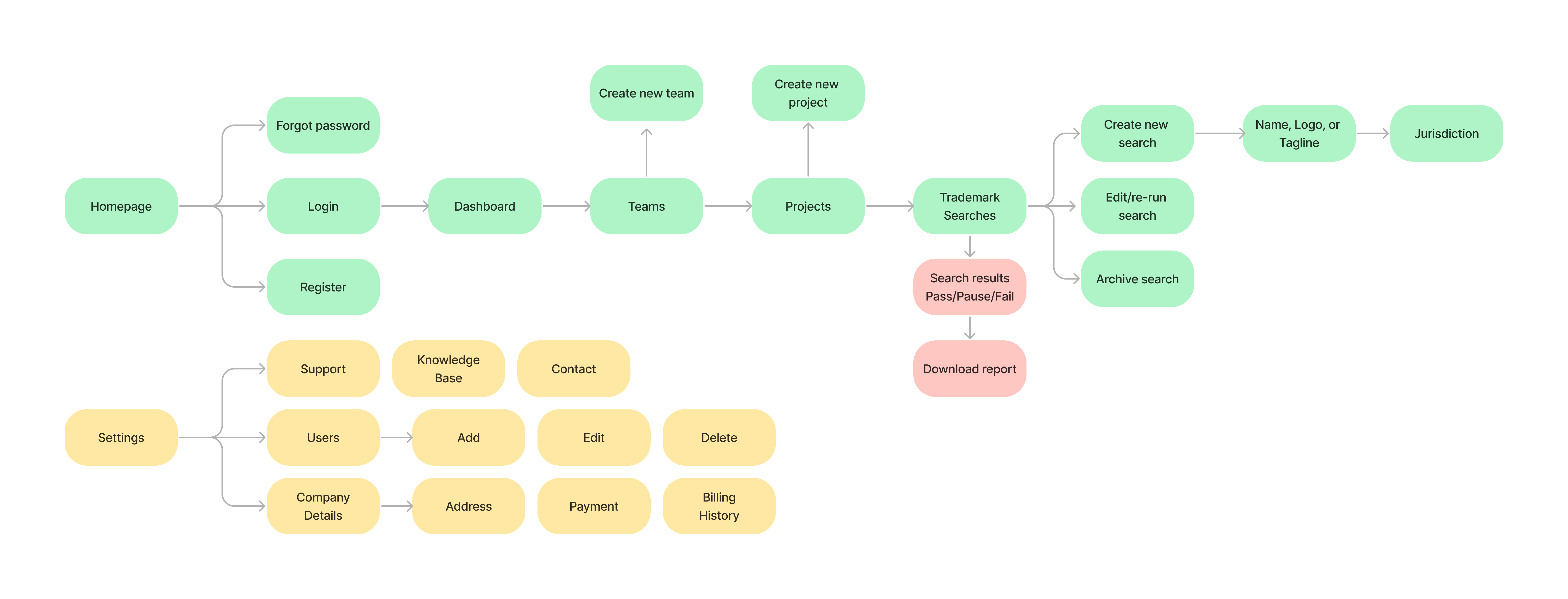
Information Architecture
To get a better understanding of the desired user flow, I created an information architecture for the team. This gave me a better understanding of the desired outcome for users before beginning to design.

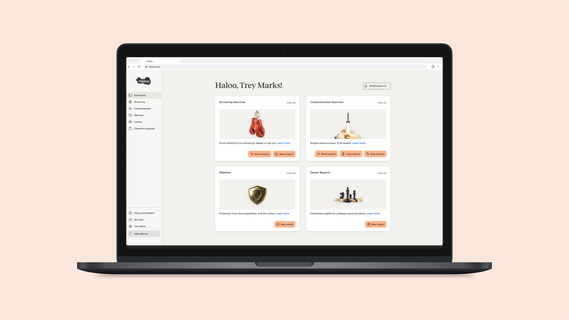
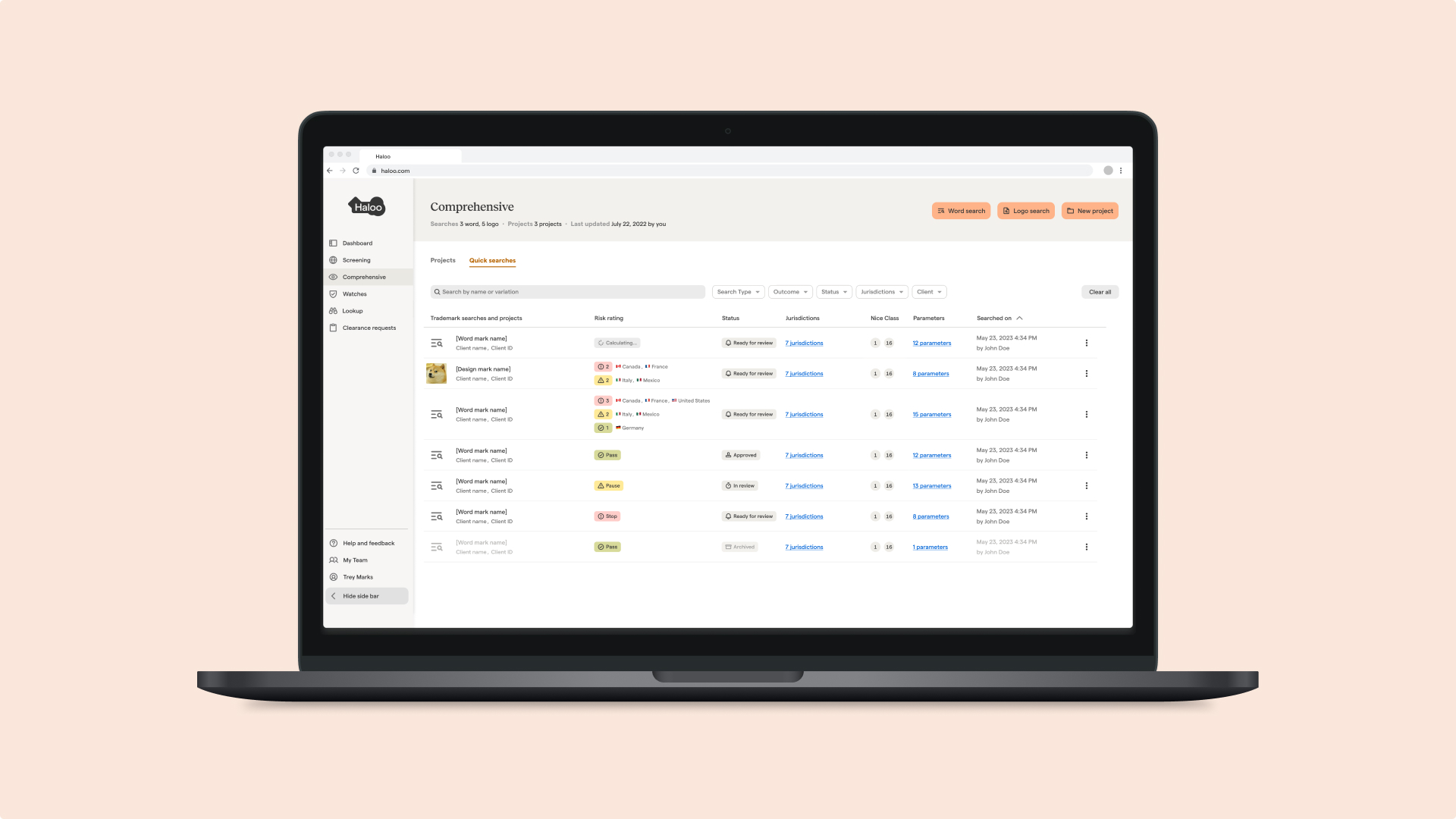
As the company was in the middle of a rebrand, there was no clear direction of visual design. We weren’t certain on the layout structure to use and often switched between a card structure and a list. At this stage, the primary product features requested by users were still unclear. The team decided on a list structure as it was easier to scan and felt similar to our SMB product.

As the company was in the middle of a rebrand, there was no clear direction of visual design. We weren’t certain on the layout structure to use and often switched between a card structure and a list. At this stage, the primary product features requested by users were still unclear. The team decided on a list structure as it was easier to scan and felt similar to our SMB product.

Creating the enterprise platform involved learning how to adapt to business needs and client feedback quickly. During the early stages of conception, I collaborated with strategists, legal experts, AI engineers, and developers to learn more about the product we were creating. Since legal documentation is involved, the lawyers on our team played a crucial role in understanding legal processes, user pain points, and insights on usability. Most of my time was spent designing the enterprise platform in Figma, demoing a prototype to the team, and later on to clients.
The work was iterative, rapidly changing, and challenging— enabling me to grow as a designer.
While working as the only designer at Haloo Enterprise, I faced many challenges. I was solving problems for users I didn’t know and essentially creating something from very little knowledge and information. It forced me to ask a lot of questions to understand who I was designing for and how they differentiated from our SMB users. The rapid startup pace forced me to skip parts of the design process that I was used to doing.
These challenges were a catalyst for my growth as a designer. I learned how to adapt to change, and how to both apply user needs as well as meet business goals while designing a solution. I was given the opportunity to speak to and empathize with our enterprise clients by demoing live Figma prototypes. This built interest in our product by various large enterprises before it was even built. I also worked alongside our dev team to launch Haloo Enterprise. Overall, I learned how to communicate and adapt as a designer.


